With real estate taxes what they are today, though, no institution can afford to pass up maxing out on the arty visitor's coin. Like the Frick Art Museum in Manhattan, which was also once a civilized and quiet refuge that has lately courted the mass market with blockbuster exhibits, the Morgan has gone big time. Its principal drawing card at the moment for many is the new architectural addition by designer du jour Renzo Piano.
Piano's expansion space could hardly be more different than the original two rooms, Morgan's Library and study, as well as the hallway between them. The new Morgan is a marriage of incompatible extremes.
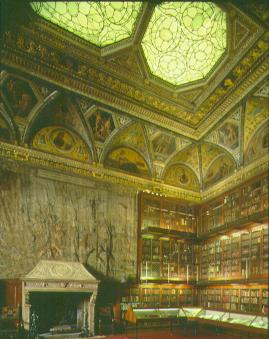
Original J.P. Morgan Library
The original library with its nearly floor-to-ceiling rare books and early editions, as well as the hallway, are brilliant evocations of the Italian Renaissance, designed in the early 20th century by the famous firm of McKim, Mead and White. Like so much of the 16th century architecture they are modeled after, they balance splendor with historical and mythological detail that helps make them human and accessible. Morgan's study is a surprisingly intimate space, containing little but a desk, old paintings on the walls and objets d'art on a shelf that runs around the room. Such furnishing as there is, is dark and restrained. The effect of the whole room is old wordly and restrained, far from the neo-Baroque frou-frou decor favored by most of the 19th century rich.Both the library and study are comfortable rooms, not cold and intimidating: you can imagine sitting in either and actually reading or studying the old books and artistic treasures they hold. I don't know anything about J.P. Morgan, but no doubt his wealth was earned for him in part by exploitation. And surely the one-upmanship of collecting played a part in his acquisitions -- not even a dedicated scholar could possibly read all those books and manuscripts in a lifetime. For all that, when visiting his quarters, you get the impression that the man was a genuine connoisseur.
The new addition, opened just this past April, had the task of integrating the study, library, and hall; a 1920s annex; and Jack's townhouse. It added exhibition rooms and provided space for the facilities no modern arts complex can do without: a restaurant, performance hall, and of course a gift shop.
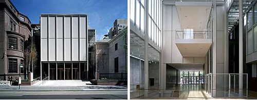
Piano's architectural contribution is ... is ... well, let's start with a picture of the outside entrance and the new central court:
Now, it's true that photographs don't do justice to architecture, but these two photos save me some explaining.
Piano's extension of the Morgan obviously couldn't have been in the Renaissance Revival style as the original -- neither the money nor, probably, the workmanship would have been available to replicate it. That isn't the issue. What bugs me is that Piano and the directors who hired him seem to have made no effort at compatibility. The spirit of the new section rejects the old.
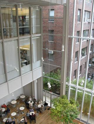
A couple of gushing newspaper articles I read make a big deal out of the way light is used as an architectural element in Piano's design. In other words, he uses a lot of glass. (I wonder how impressive the light will be next winter when it's gray outside.) But the original wing deliberately doesn't admit external light. It chooses not to bring the outdoors indoors. The library and study were created in the spirit of introversion. They are places to read, contemplate, and think. Piano's contribution rejects that sensibility -- it's made for high-class, adult mall rats, not scholars or philosophers.
Piano's glass is empty.
It would have been possible to design a fully contemporary expansion that would complement the original rooms, using darker, richly colored materials, updating Renaissance design elements. Piano's architecture isn't even contemporary. The closest thing you can compare it to is Swedish modern, circa 1950, a refinement of the Bauhaus. Piano has given us severe straight lines, blond wood, and -- are you ready for this? -- glass enclosed elevators! I'll bet one of these days, Radisson and Westin hotels will be copying that idea!The entrance is now from Madison Avenue into the late-neo-Sauna court, which takes center stage. J.P. Morgan's glorious rooms are out of the view, their entrance tucked away in a far corner. Maybe some visitors never even discover them.
The best I can say for the Piano contribution is that it's tasteful, in a bland, unsurprising way. New Yorkers have an expression to indicate casual disdain: "Eh." I couldn't say it better.
On a purely functional level, the renovation is successful. It's opened up plenty of new fiendishly sterile, well-lighted space for the exhibits; the library no longer is forced to house display cases. And you can now walk inside the study, which was formerly roped off, a definite improvement.
None of my complaints should discourage you from visiting the Morgan if you are interested in its illuminated manuscripts and early books, including transitionary books that were typeset but still had hand-painted illustrations and initials. The collection is breathtaking. There is nothing like an illuminated manuscript to give you an exact idea of the decorative ideal of the Middle Ages (and in a few exhibits on display, even earlier). Paintings that old have inevitably faded with time or been restored, but the inks of almost a millennium ago appear to be perfectly preserved, as though the illuminations were painted last week. You cannot doubt that the artists and craftsmen of the monasteries and workshops, as well as their ecclesiastical and noble patrons, were in love with glowing color. The angels with multiply tinted, iridescent wings were part of their lives.


2 comments:
Slightly off-topic, but Jack Morgan could apparently *write* a little bit better than many of today's corporate communications specialists:
business writing, then and now
Great write-up!
Post a Comment